
Billboard and Bus Wrap
Overview
Located in Fresno, California, Fresno City College serves as the gateway to California State University (CSU) and University of California (UC) schools. While not everyone who passes through our doors goes on to transfer to a four-year institution, they do leave with valuable certificates in fields such as automotive, dental, nursing, and more.
Fresno City College actively engages in numerous promotions and campaigns to boost student enrollment. Our student body is diverse, ranging from recent high school graduates to individuals seeking to seize new educational opportunities later in life or those embarking on a career change. The possibilities are endless.
My Role
- Design
- Editing
Technologies
- Photoshop
- Illustrator
Goal
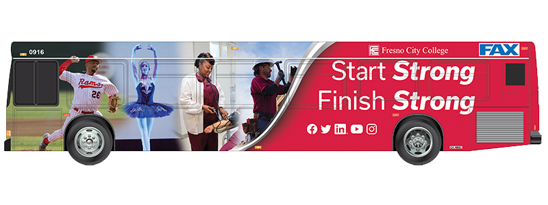
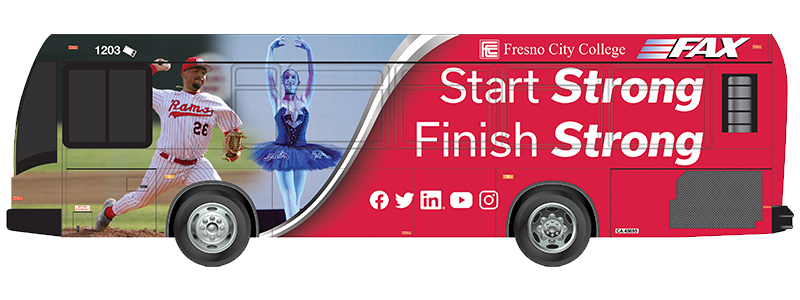
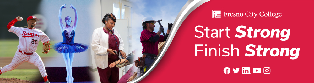
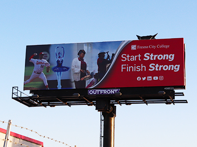
The objective of this design project was to create a compelling marketing campaign for bus wraps and billboards. Having spent approximately 8 months in this role, I continue to gain insights into how these promotions function and how we can effectively connect with our target audience. As previously mentioned, Fresno City College offers a wealth of opportunities across various career paths, with the tagline "Start Strong Finish Strong" chosen by our team.
With this concept in mind, my overarching idea was to showcase students actively engaged in their respective fields of study. College life can be demanding, taking a toll on one's mental and physical well-being. By pairing these impactful images with motivating text, our aim is to inspire struggling students, high schoolers, or anyone considering returning to education. We hope that they can envision themselves in these professions and find the encouragement to pursue their aspirations.
Process
My initial focus was on the bus wrap design. The team had shared some concept samples they found promising, which I combined with my research to develop the final design you see here. While the images presented challenges in terms of framing, I employed Adobe Photoshop's generative fill feature to streamline the design process, effectively manipulating the images. This, coupled with masking and blending techniques, as well as the inclusion of swoosh shapes, contributed to the overall design's impact.
For the text, I sought a bold font that would grab attention and set itself apart from our usual, go-to fonts. I settled on the "Usual" font, as it offered the right blend of thickness and balance to complement the imagery.
Final Design
The final design features four students on the left representing our Baseball, Dance, Nursing, and Construction programs. Fresno City College is renowned for its commitment to academic excellence, and we have effectively conveyed this in our previous promotions. On the right side, you'll find our impactful tagline, along with links to our primary social media platforms. Speaking of social media, we engaged in quite a discussion about their representation. Should we opt for the 'X' icon (formerly known as Twitter) or stick with the familiar bird symbol? Furthermore, should we include icons for Threads and TikTok? The abundance of platforms presented us with the challenge of selecting the most relevant icons to effectively convey our online presence.
Reflection
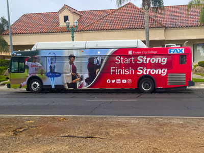
On the whole, I am delighted with the outcome of this project. It marked my first experience working on a project of this scale. While it may be considered basic work by some, there's something special about seeing your creations on display while driving down the highway or waiting at a bus stop. It just hits different. This project presented enjoyable challenges, particularly in adapting the design for billboards, and I look forward to witnessing my work in a more public setting beyond the confines of our school's walls.