
Esuca Clothing
Overview
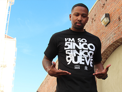
Founded in 2007, Esuca emerged from the dynamic graffiti and hip-hop scene, seamlessly infusing urban artistry into its streetwear. Over the past decade, it has gracefully evolved from its graffiti roots into a cherished local institution, uniting a community of creatives through its unique designs and unwavering commitment. Esuca's core mission has always been rooted in producing locally-inspired apparel while connecting with the ever-changing tapestry of current and past cultures.
Esuca's overarching objective is to maintain its status as a prominent streetwear brand while staying true to its Central Valley origins. The brand seeks to inspire individuals by underscoring that greatness can emerge from humble beginnings. Esuca's profound dedication extends to collaborations with local musicians and artists, driven by a genuine passion for art itself, with the primary goal of crafting truly remarkable and impactful designs that resonate not only within our community but also with a broader audience.

Goal
With a diverse cultural backdrop and a keen ear to the streets, the logo and branding aimed for simplicity and relatability. Esuca's aspiration was to push the boundaries of printing and design, experimenting with inks rarely used by local clothing brands, such as 3M Reflective ink and glow-in-the-dark ink. The brand also introduced sticker packs inspired by various themes, including 90's nostalgia, offered every summer.
Process
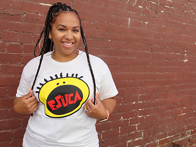
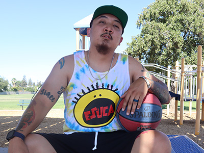
Inspired by the iconic Bay Area artist Mac Dre, who left an indelible mark on California, I incorporated elements of his persona and lifestyle into the Thizz brand of a pill, seamlessly integrated with the letter "e." The brand's name, "Esuca," possesses a unique symmetry when reversed, spelling "Acuse," the creator's artist name.
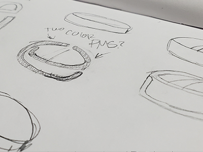
Given the goal of fusing the letter "E" and a pill, a lowercase letterform was chosen to emphasize its rounded aesthetics. The challenge lay in angling the pill to appear as if it rested on a flat surface and deconstructing it into elements that formed both an "e" and a pill. The name's symmetry was meticulously crafted to achieve a harmonious visual balance.
Final Design
The final result proved exceptional. Both the icon and the name possess standalone value, making them versatile for use in various designs. The Esuca brand continues to thrive, with its logo gracing shirt tags, hats, banners, stickers, and other merchandise. While I contemplated creating an ambigram with the text, the divergent orientations of the "e" and "a" made this a challenging endeavor.

Reflection
Regarding the creative process, I didn't dedicate an extensive amount of time to sketching; rather, I brainstormed within my mind. The design concept crystallized around the third sketch, and I immediately recognized it as the logo. I chose not to disclose my involvement with this brand to friends or local influencers initially, opting for organic growth through customer engagement and word of mouth. Of course, we employed marketing strategies and conducted photoshoots, as any brand would. I consider this project a resounding success, with sales spanning across the United States and even reaching overseas markets.